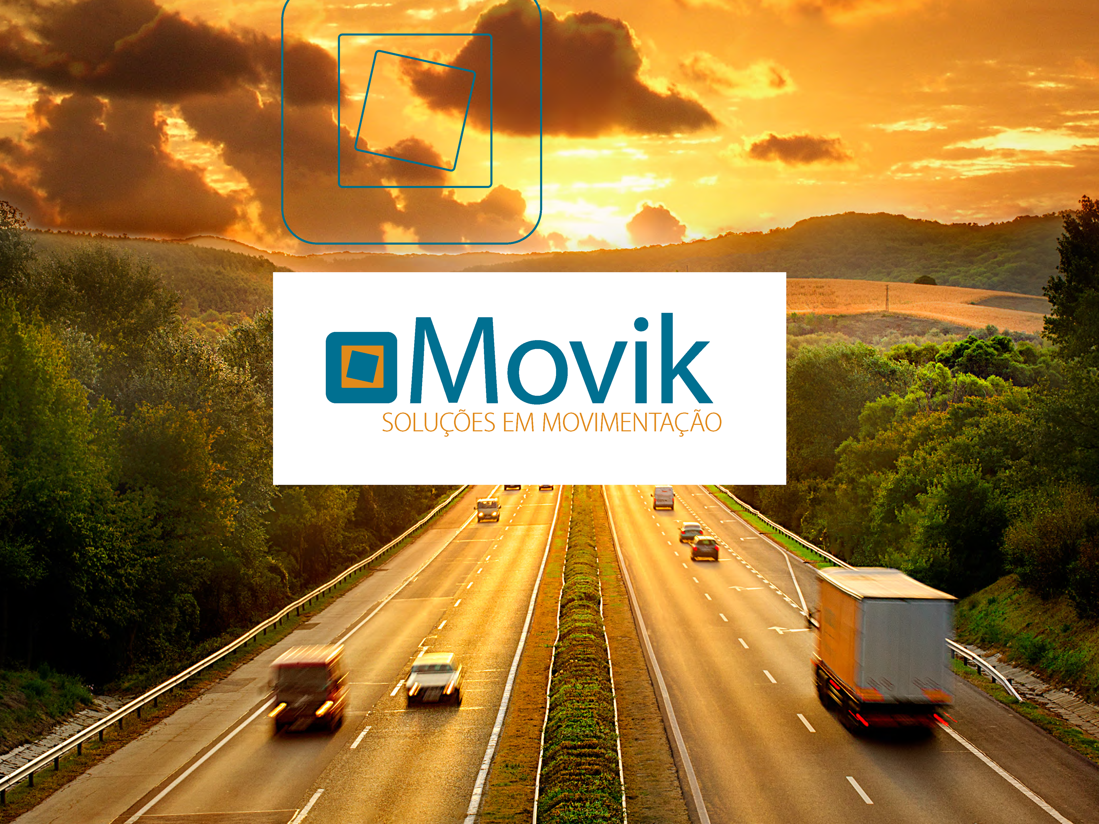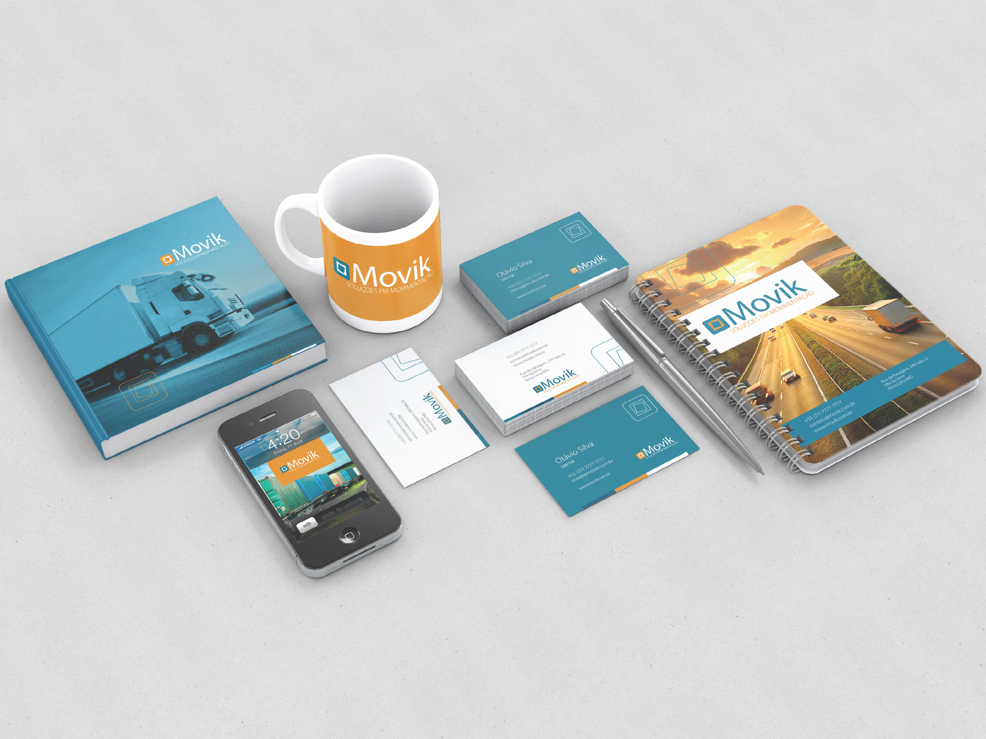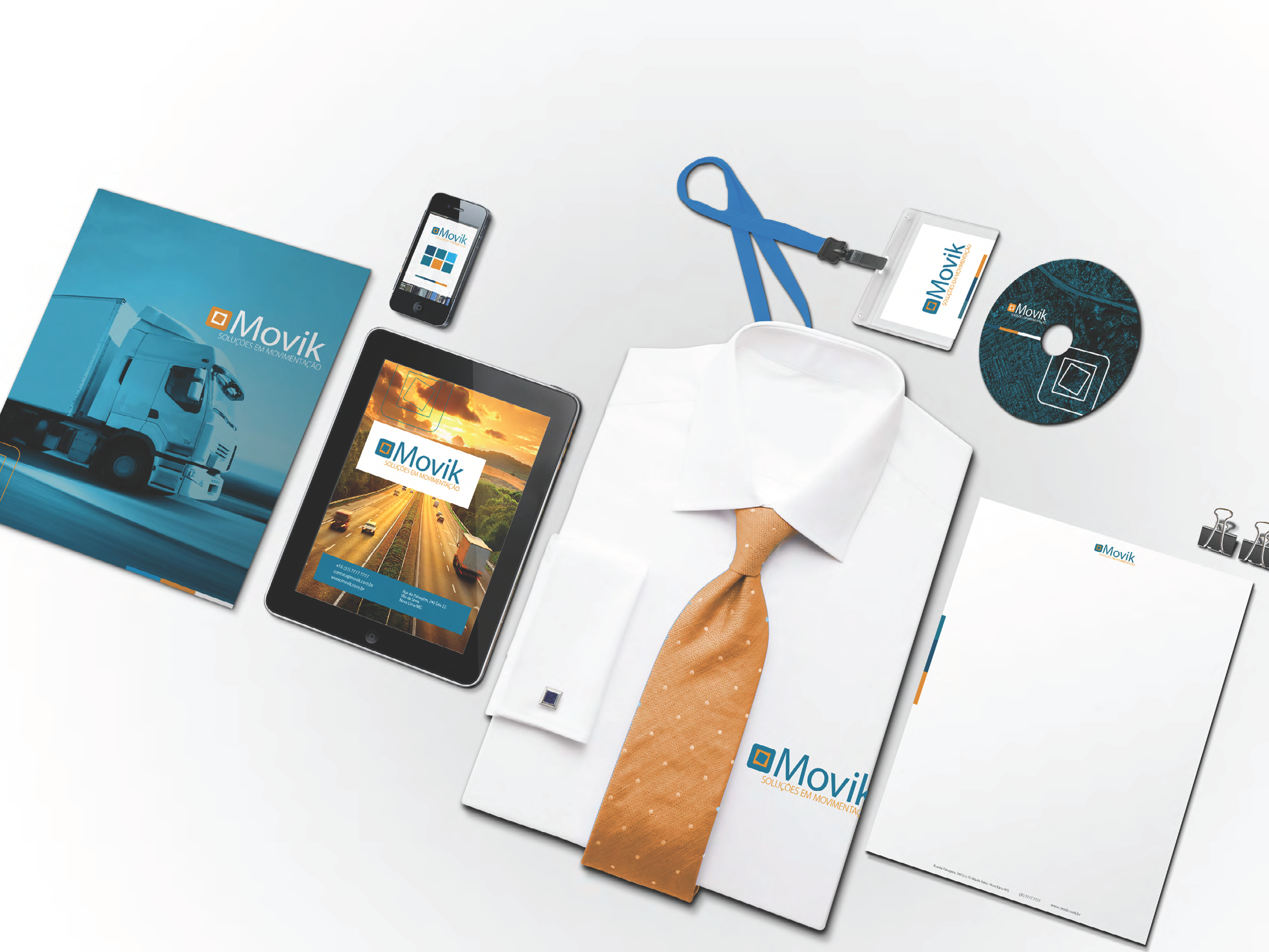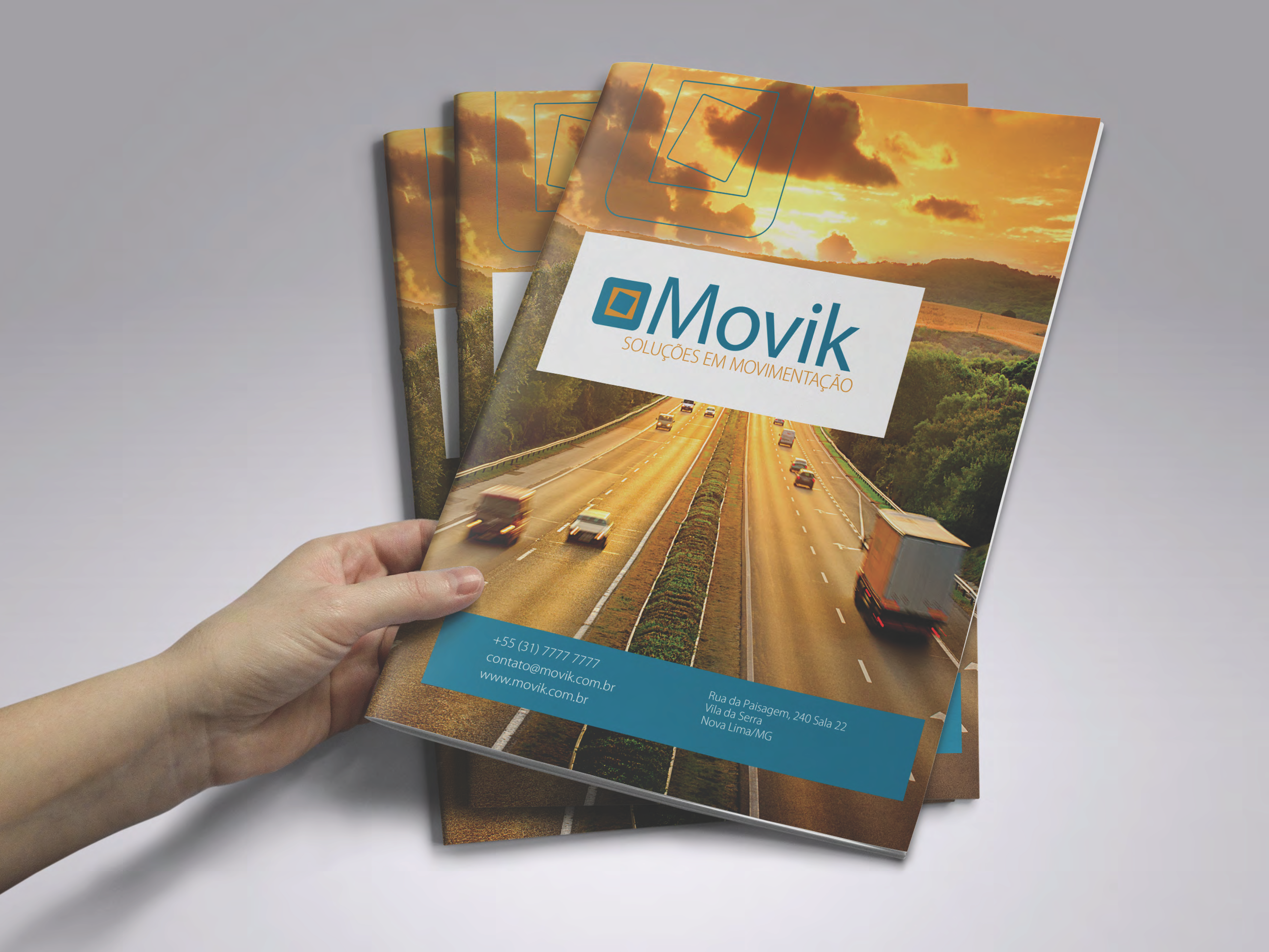

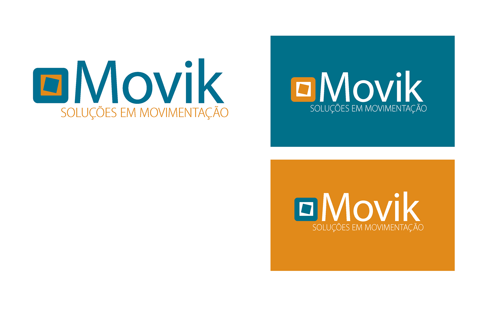
As the name suggests, Movik is a brand that represents movement.
The company specializes in handling large-scale equipment and provides all operations and services related to this sector.
It also offers equipment rental.
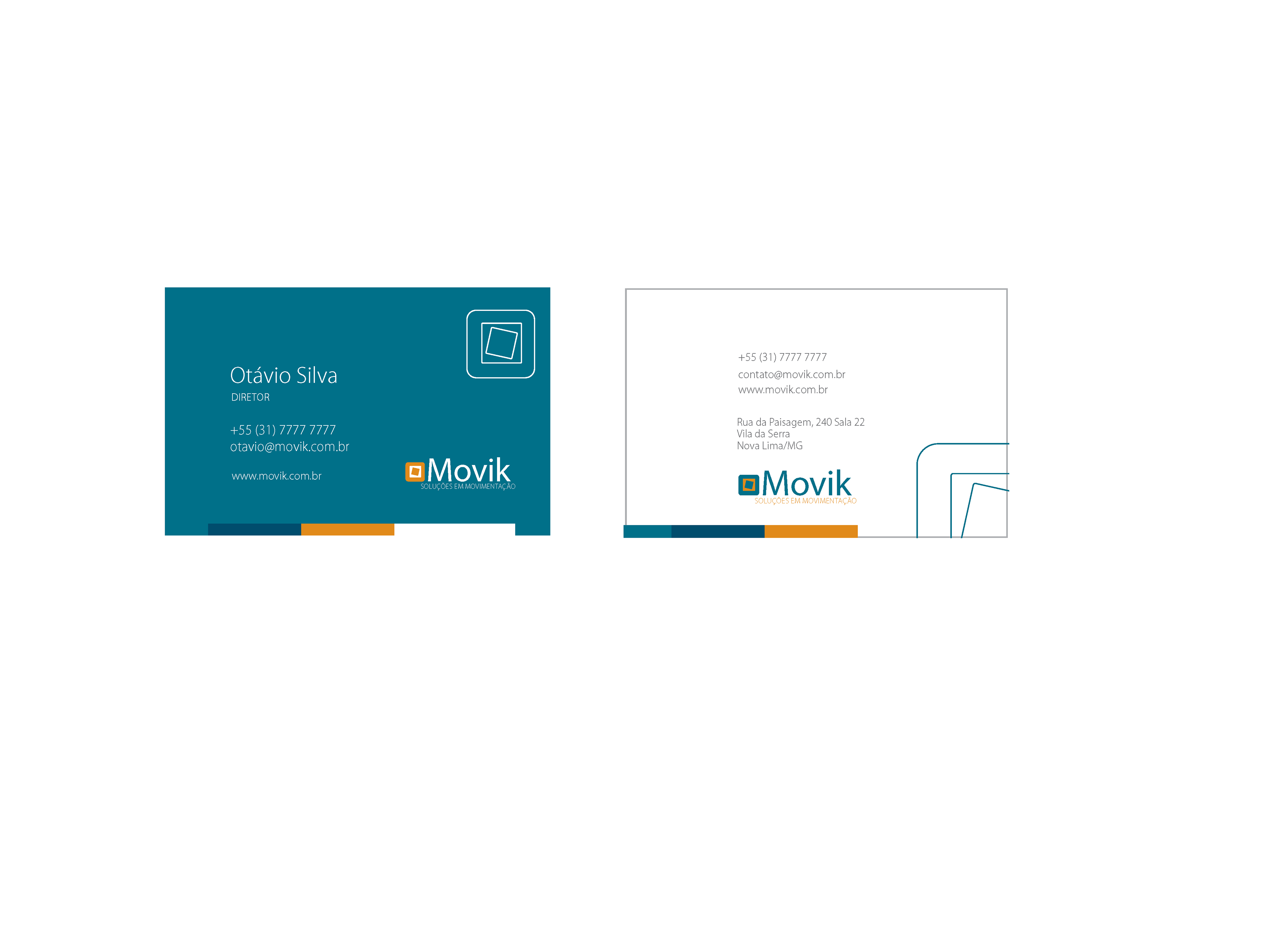
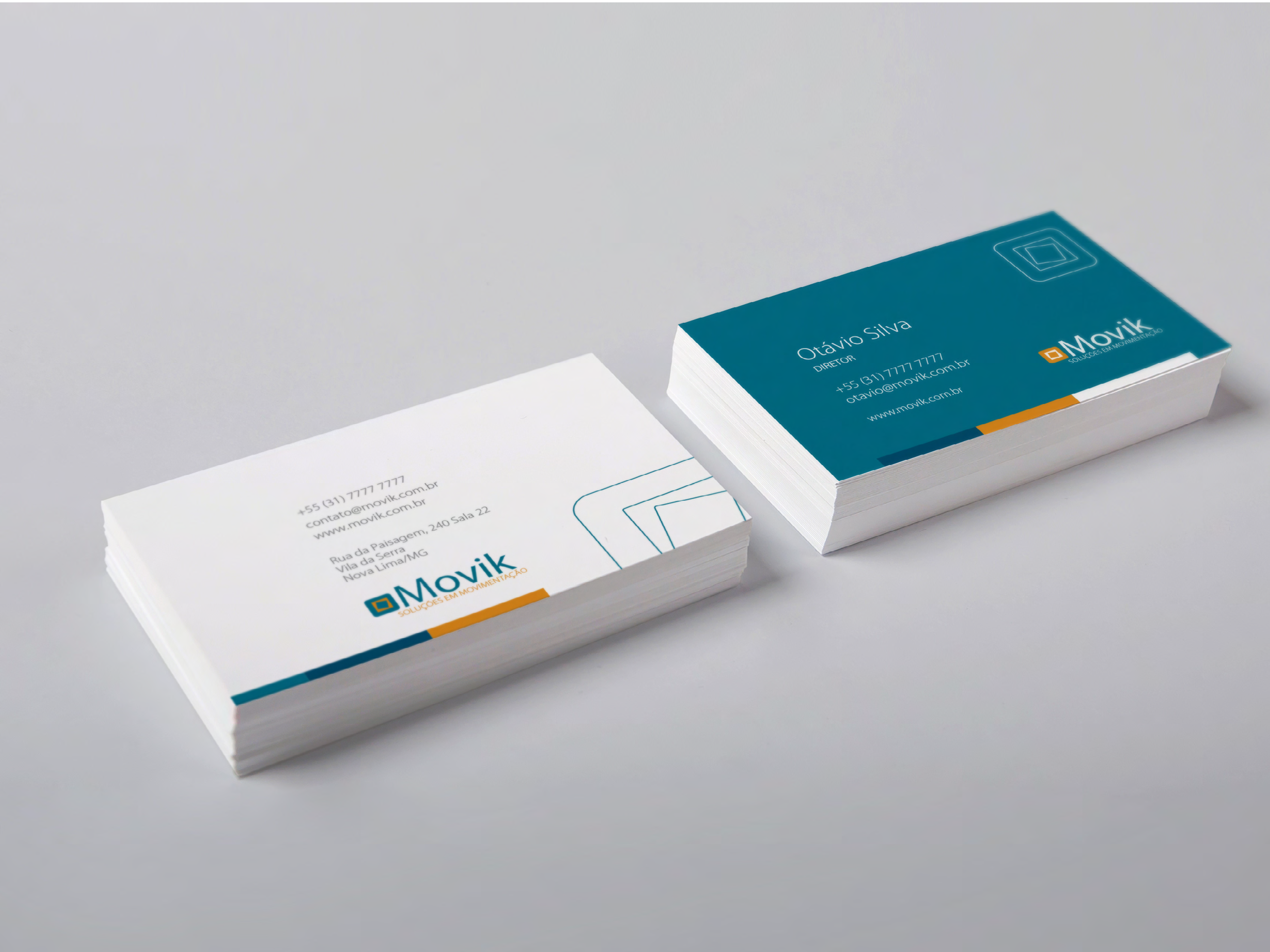
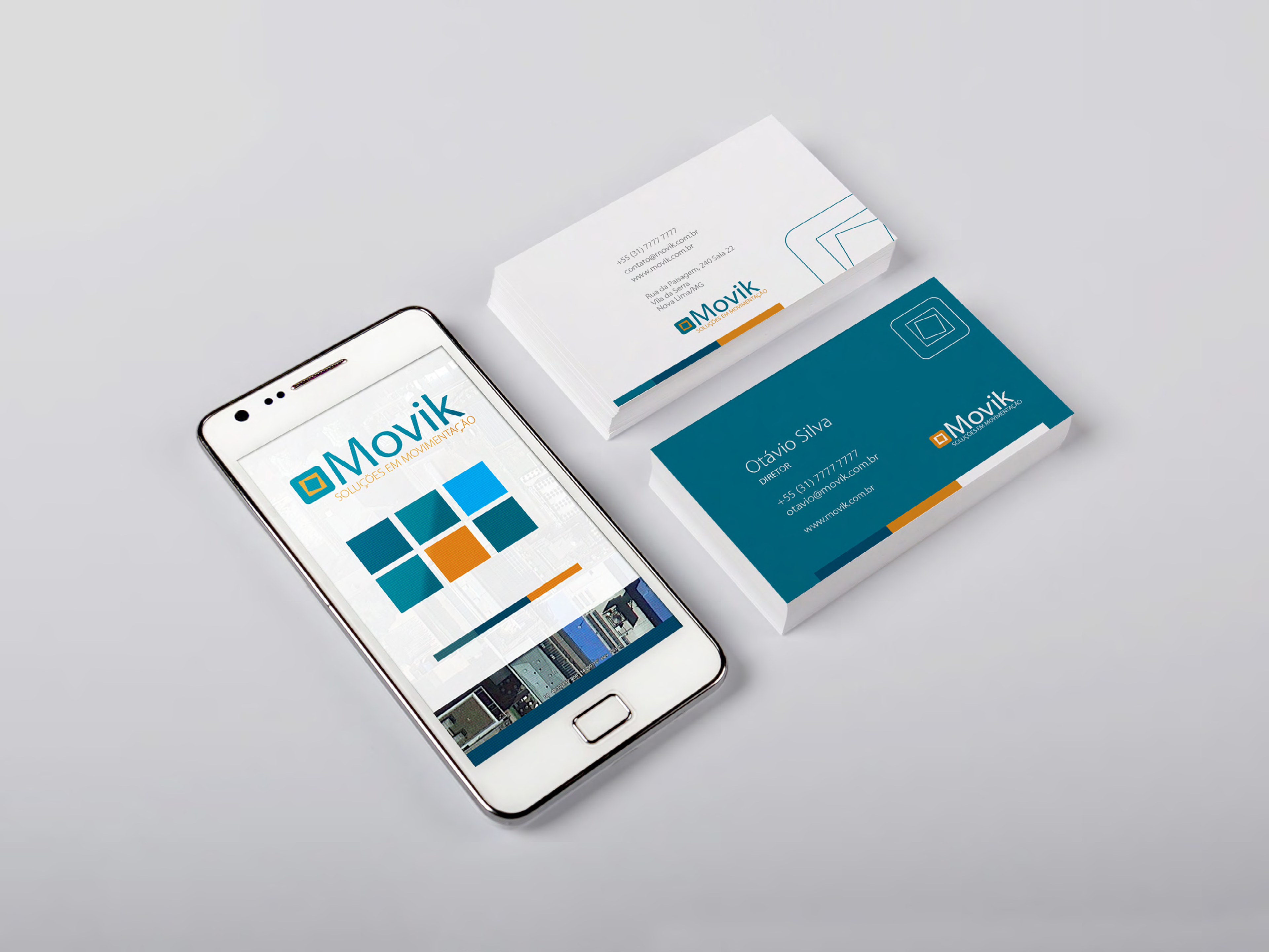
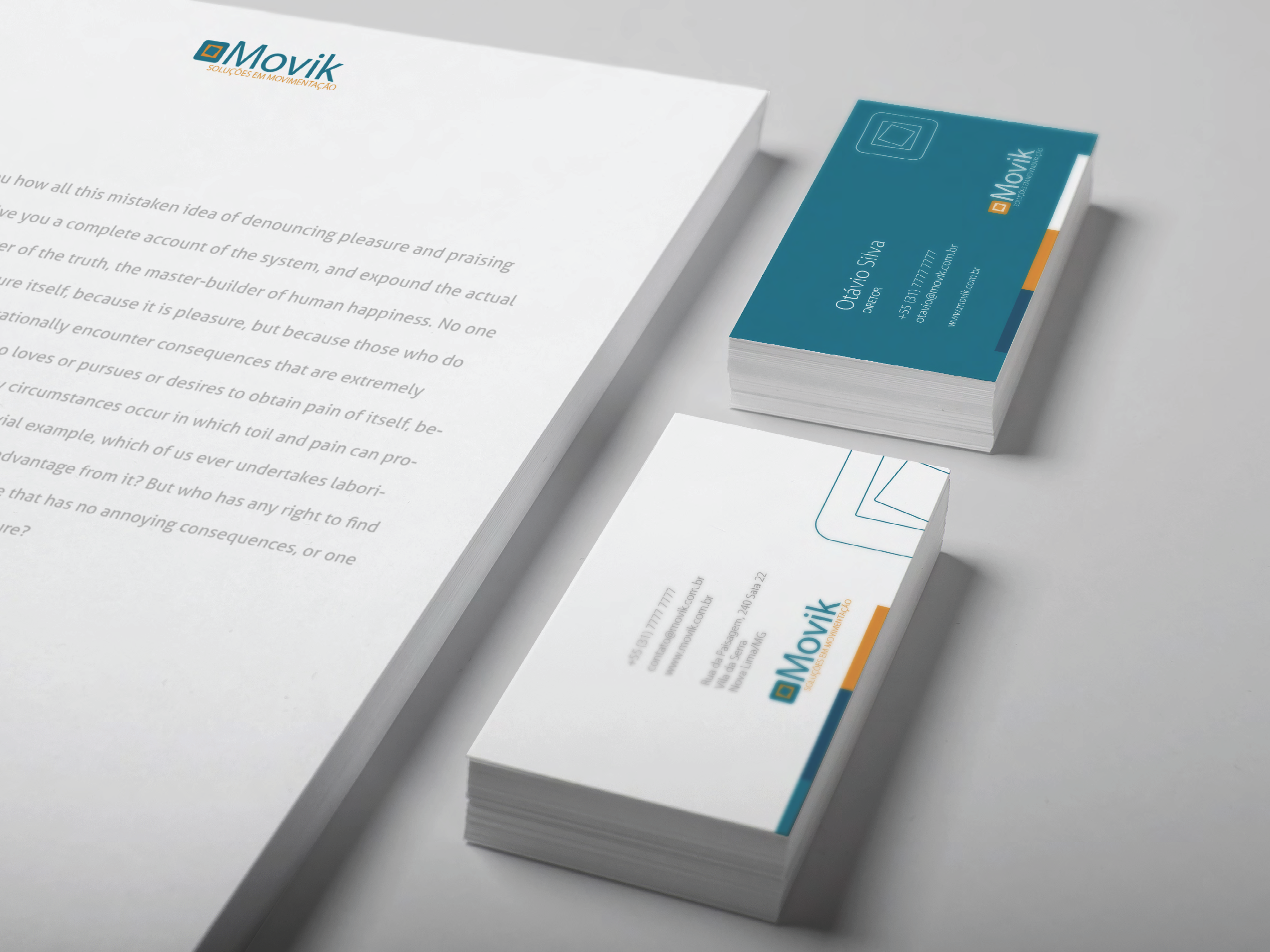
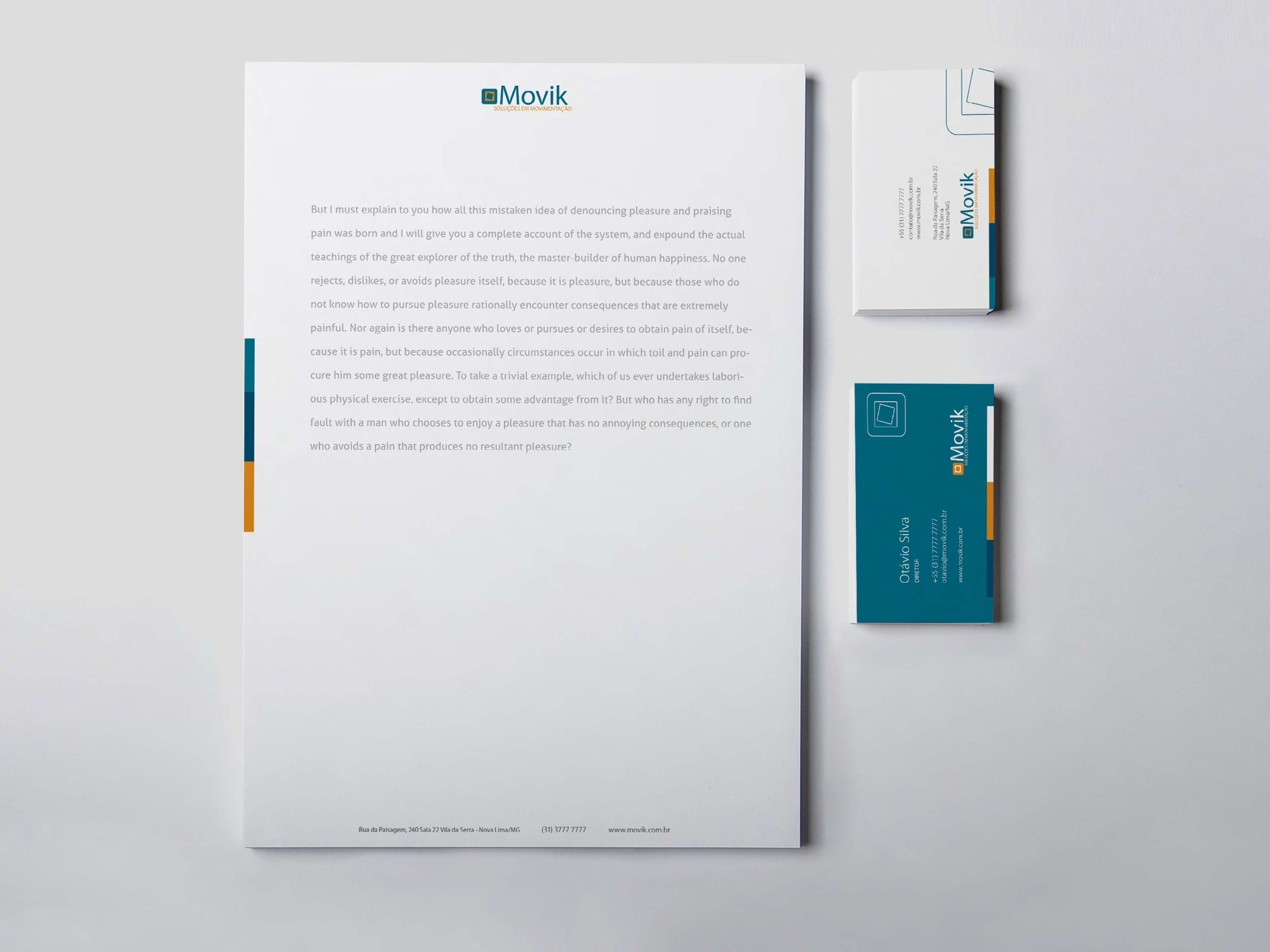
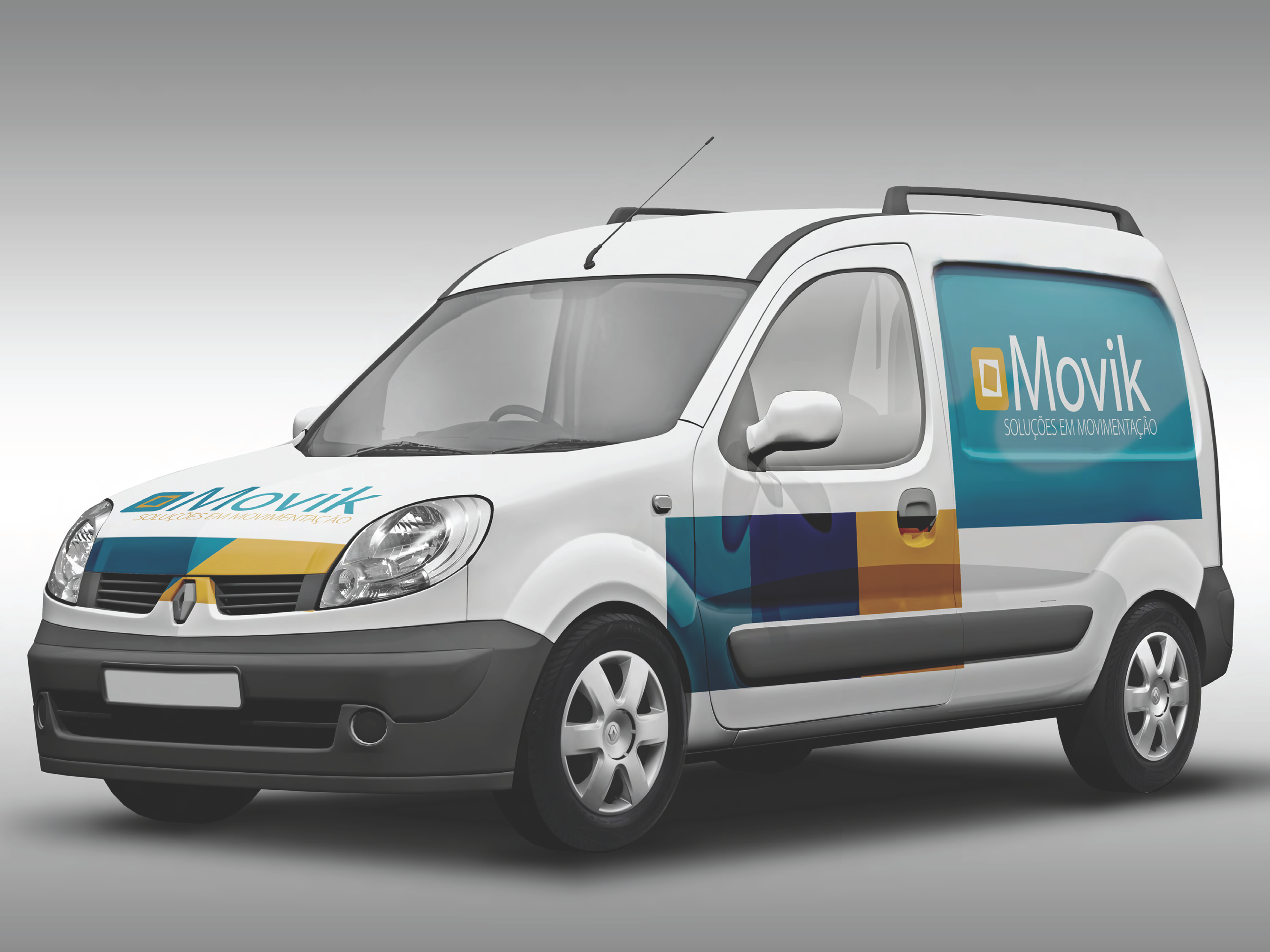
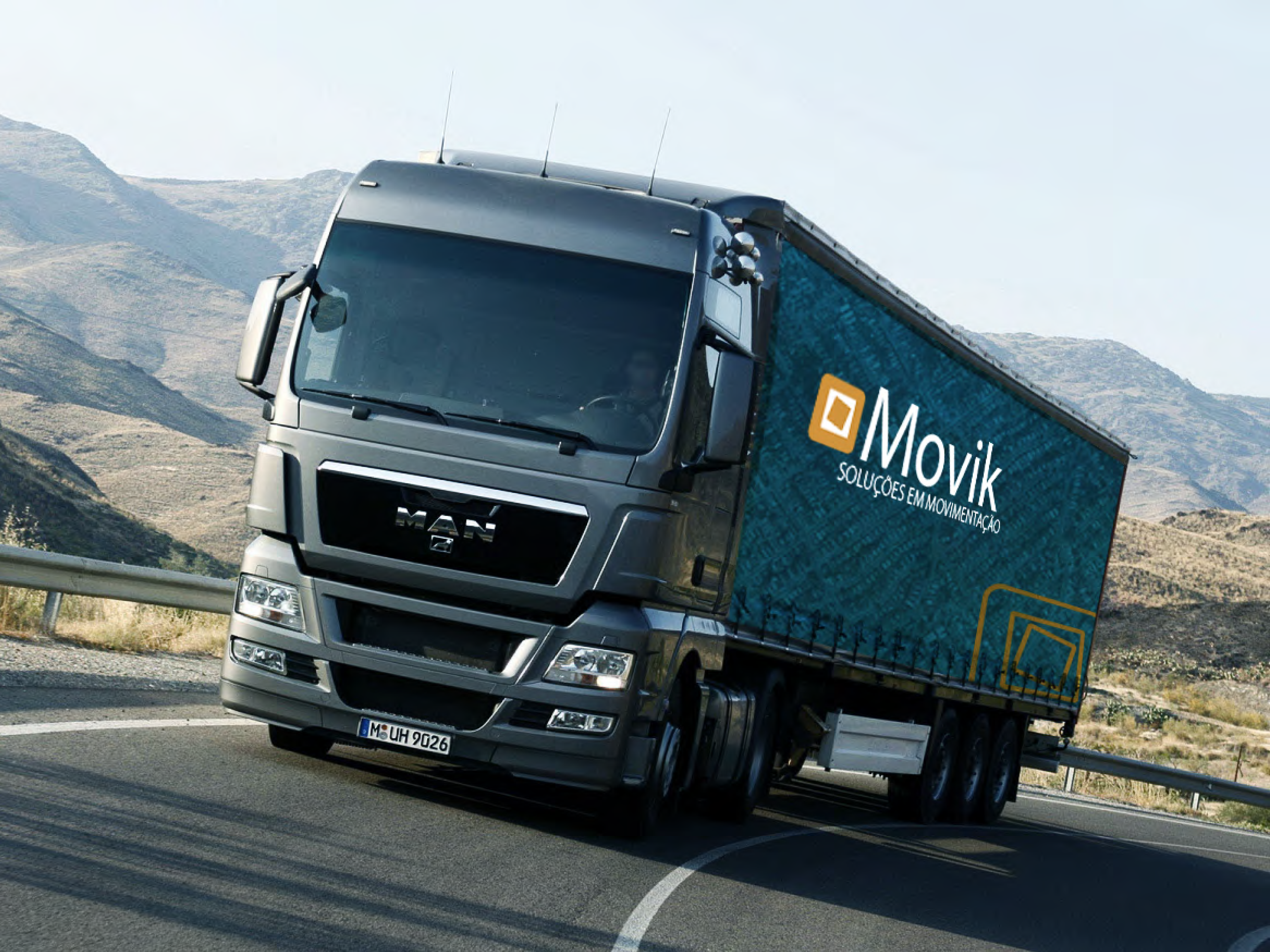
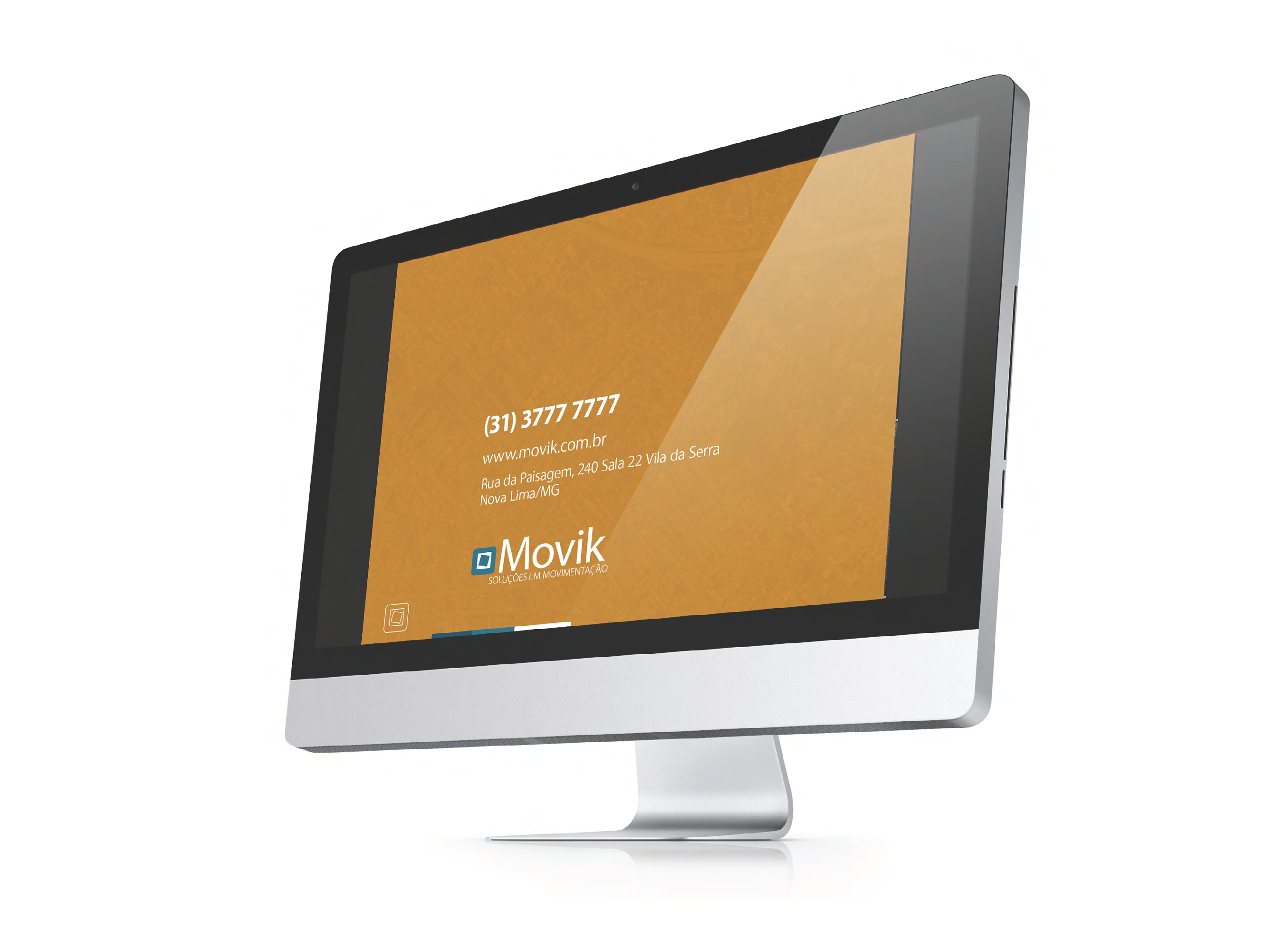
The visual identity combines a modern typeface with a symbol that evokes modules in motion.
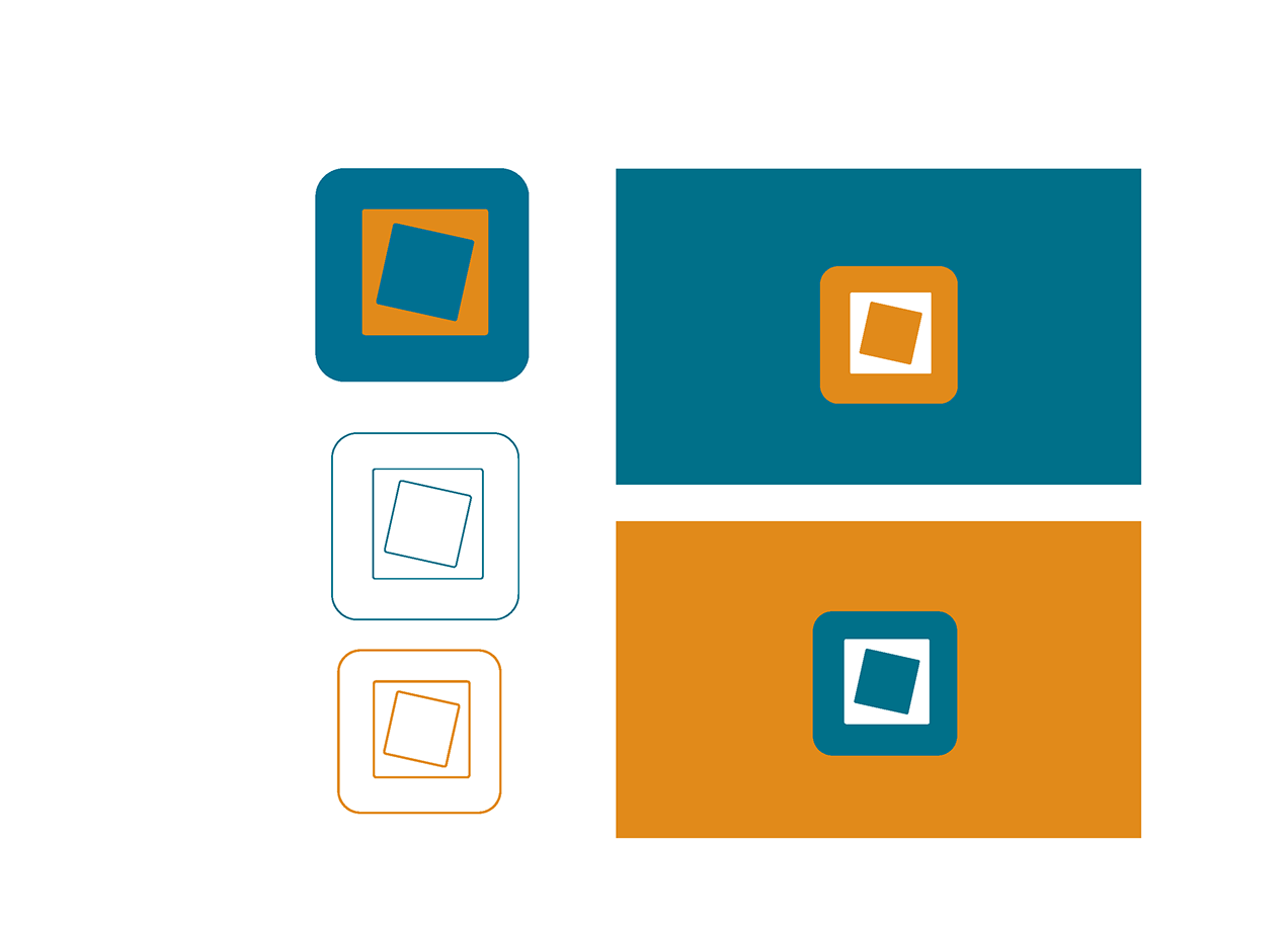
The MOVIK symbol lends itself to different interpretations.
It can be seen as objects placed inside a box, or as the top‑down representation of a mapped layout.