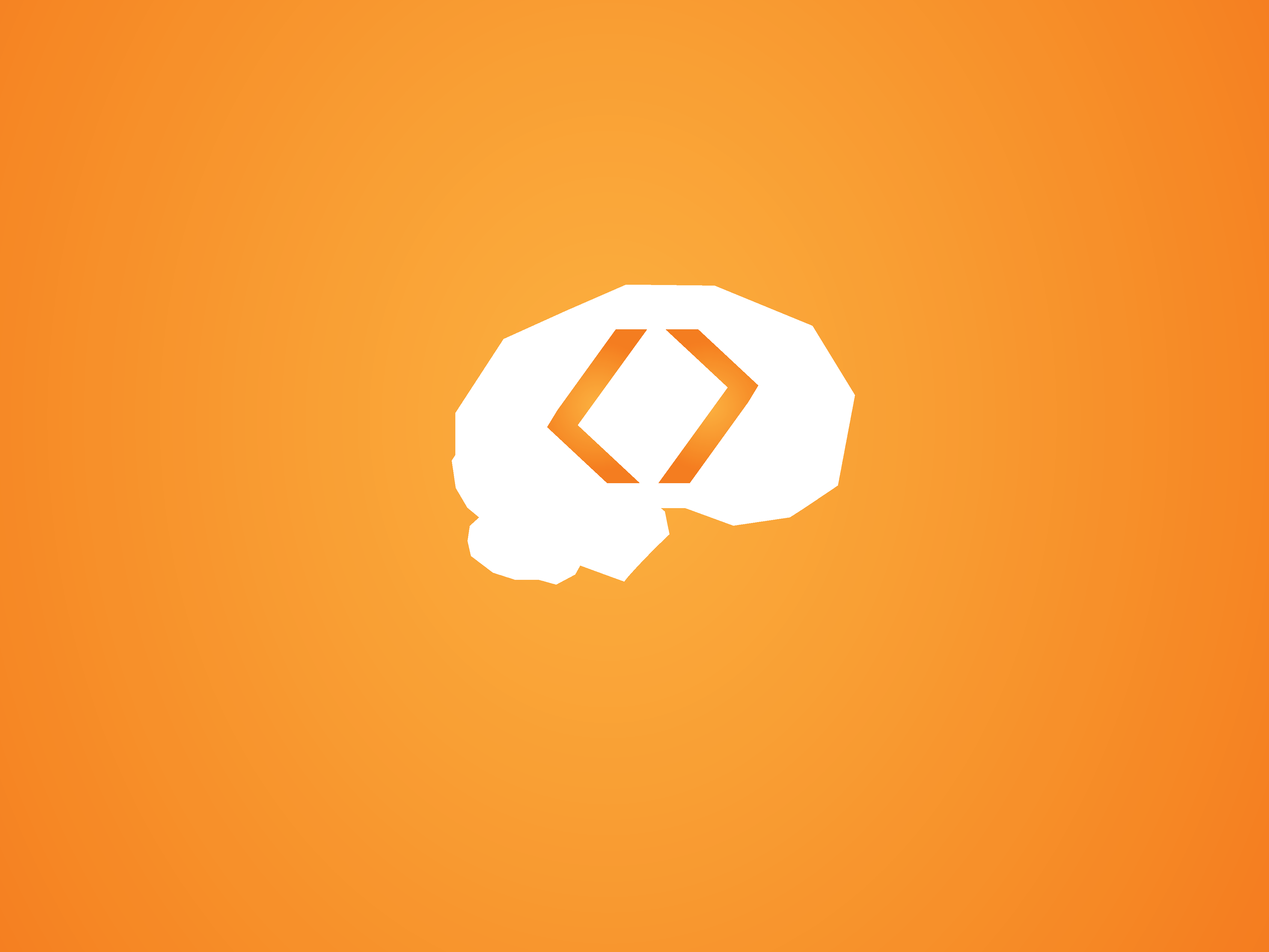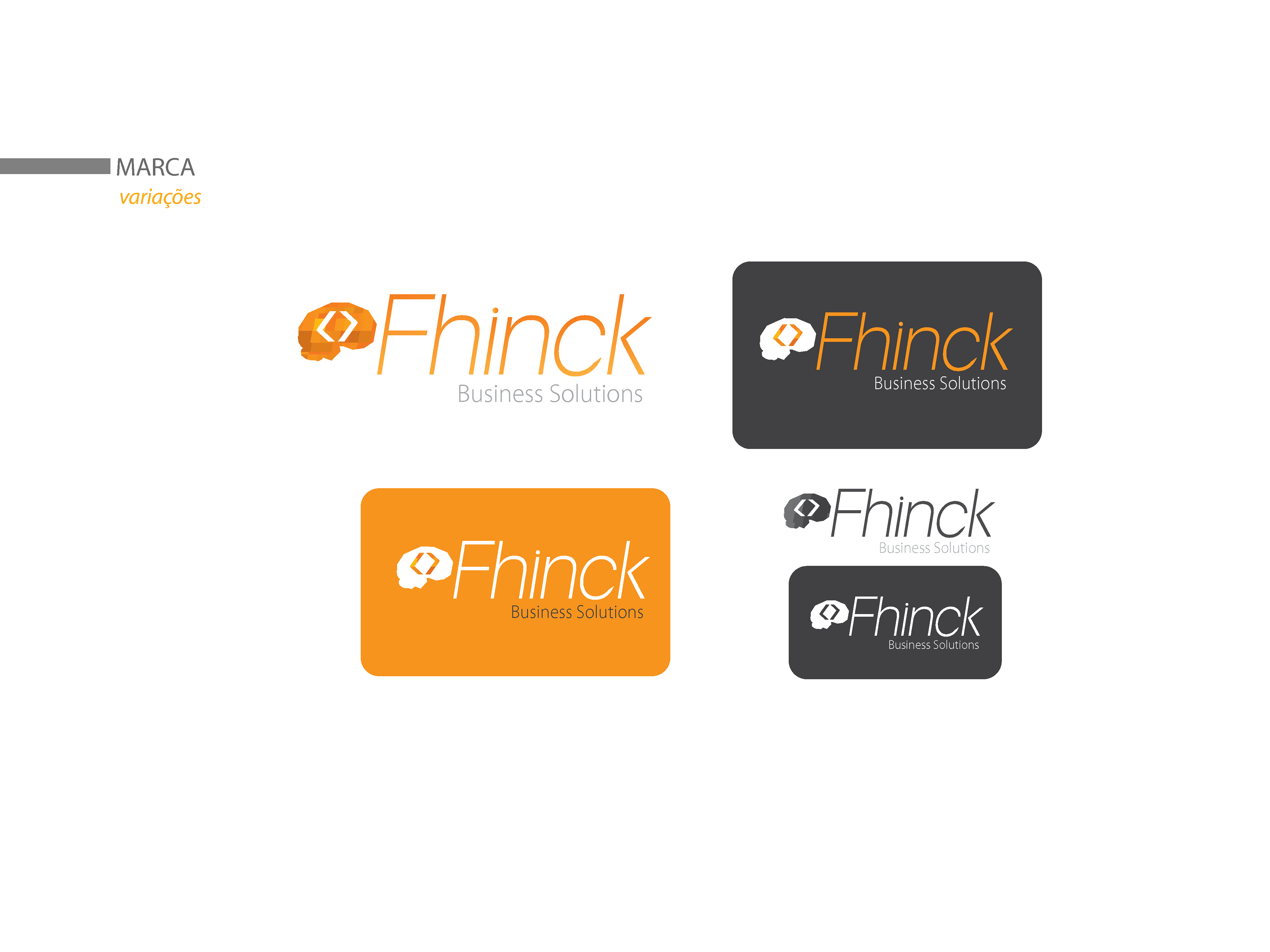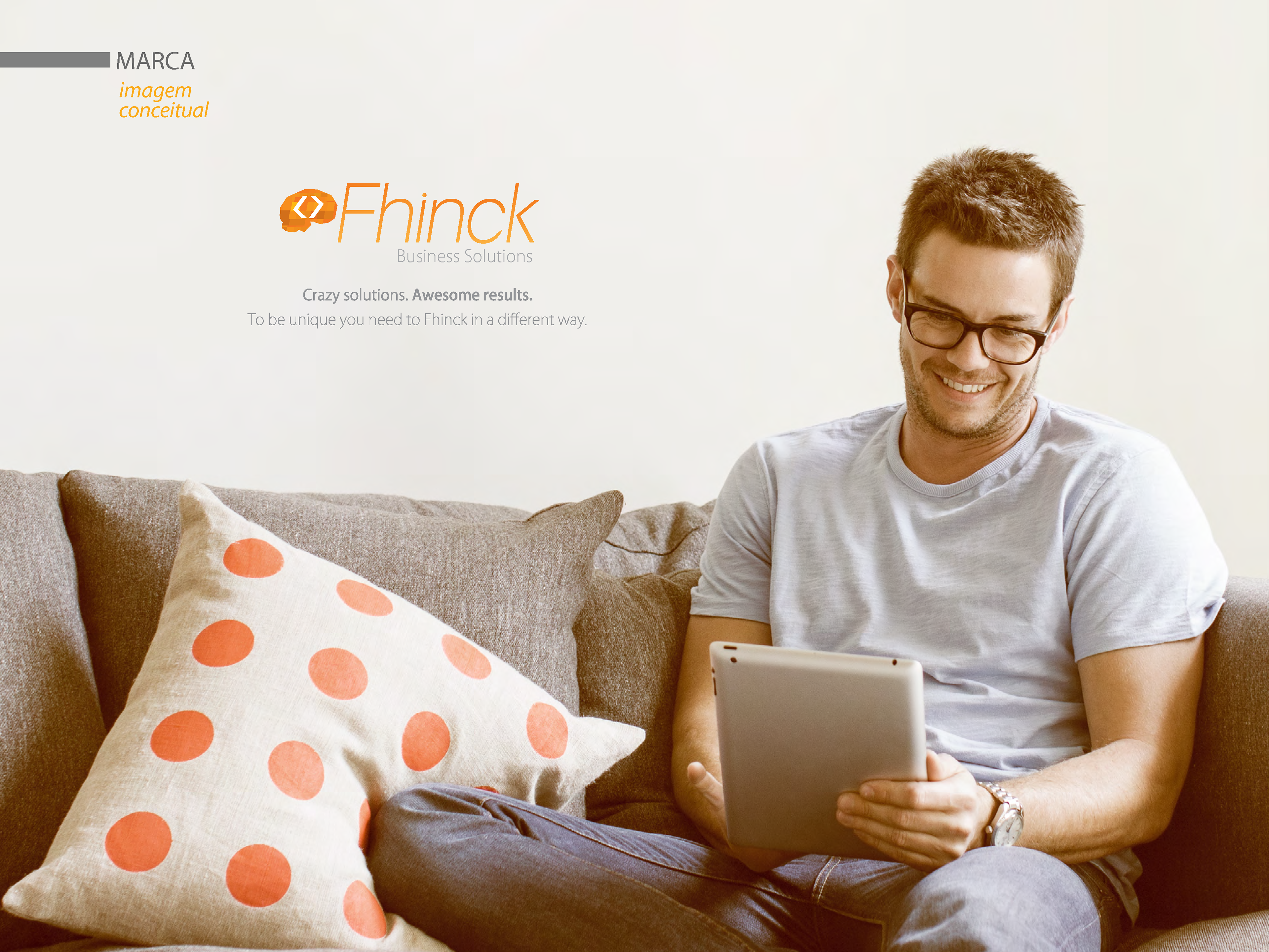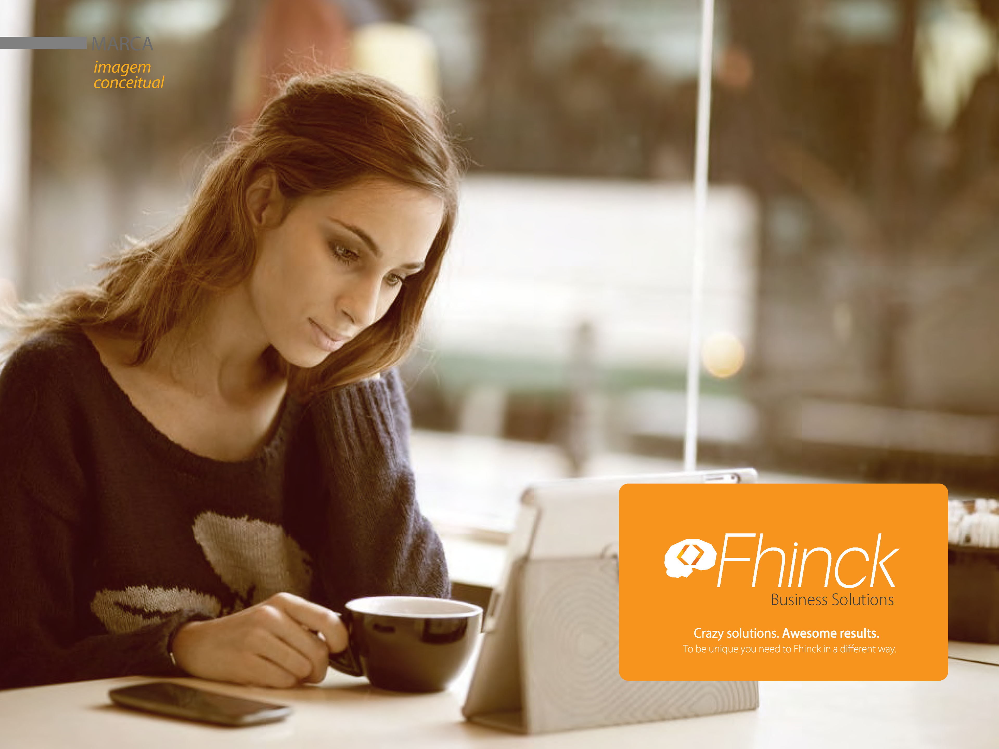

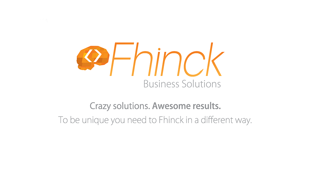
The Fhinck brand is composed of a clean, sans-serif typeface with a symbol to its left, which is a synthetic representation of a brain silhouette.
Inserted within the brain shape are two visual elements that can be interpreted in various ways. We can understand them as two brackets (symbols widely used in various programming languages). We can also interpret them as two arrows that indicate the multiplicity of paths that our solutions can follow.
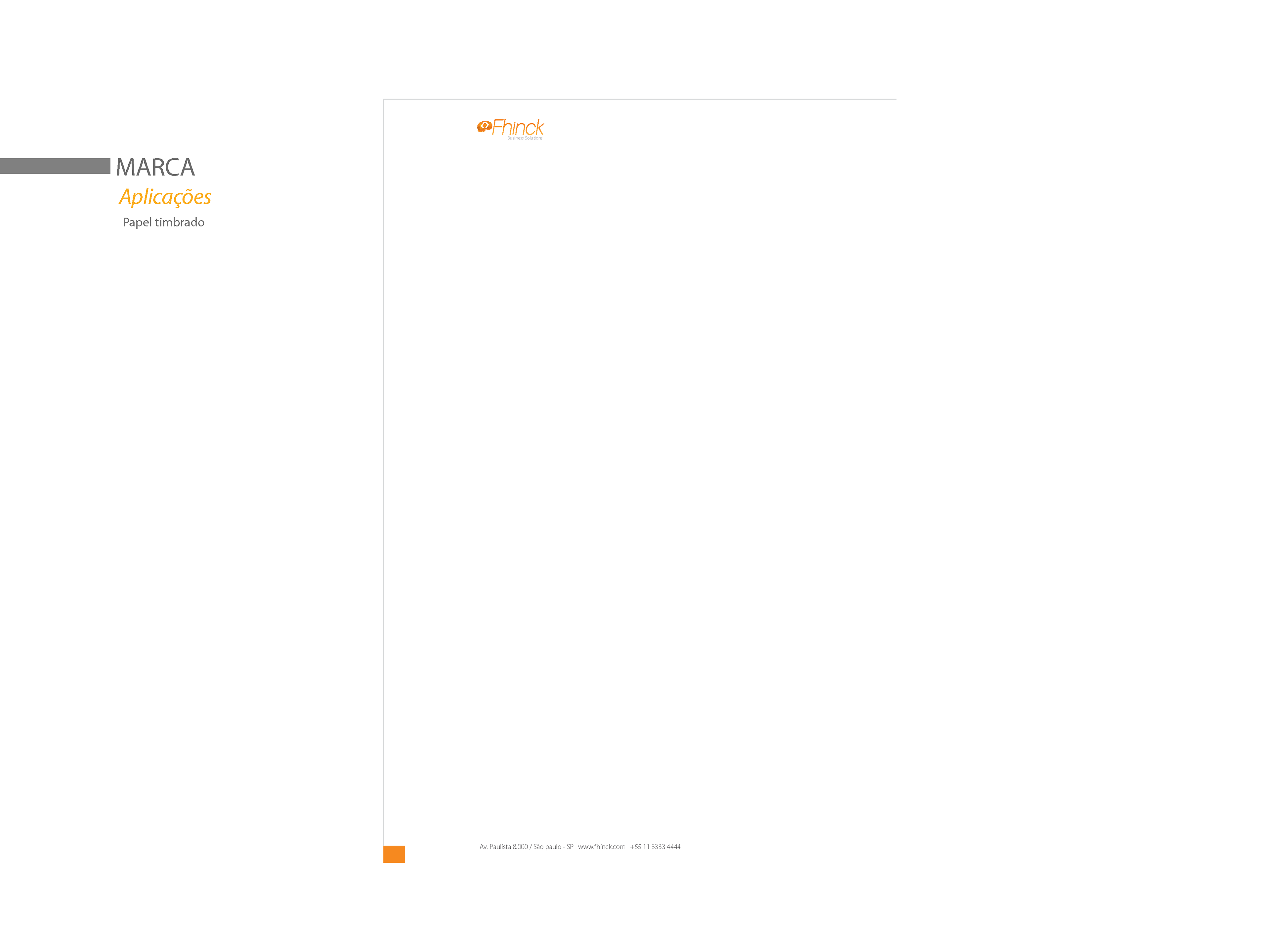
Below the name we have the tagline "Business Solutions," which helps inform new clients about which segment Fhinck belongs to.
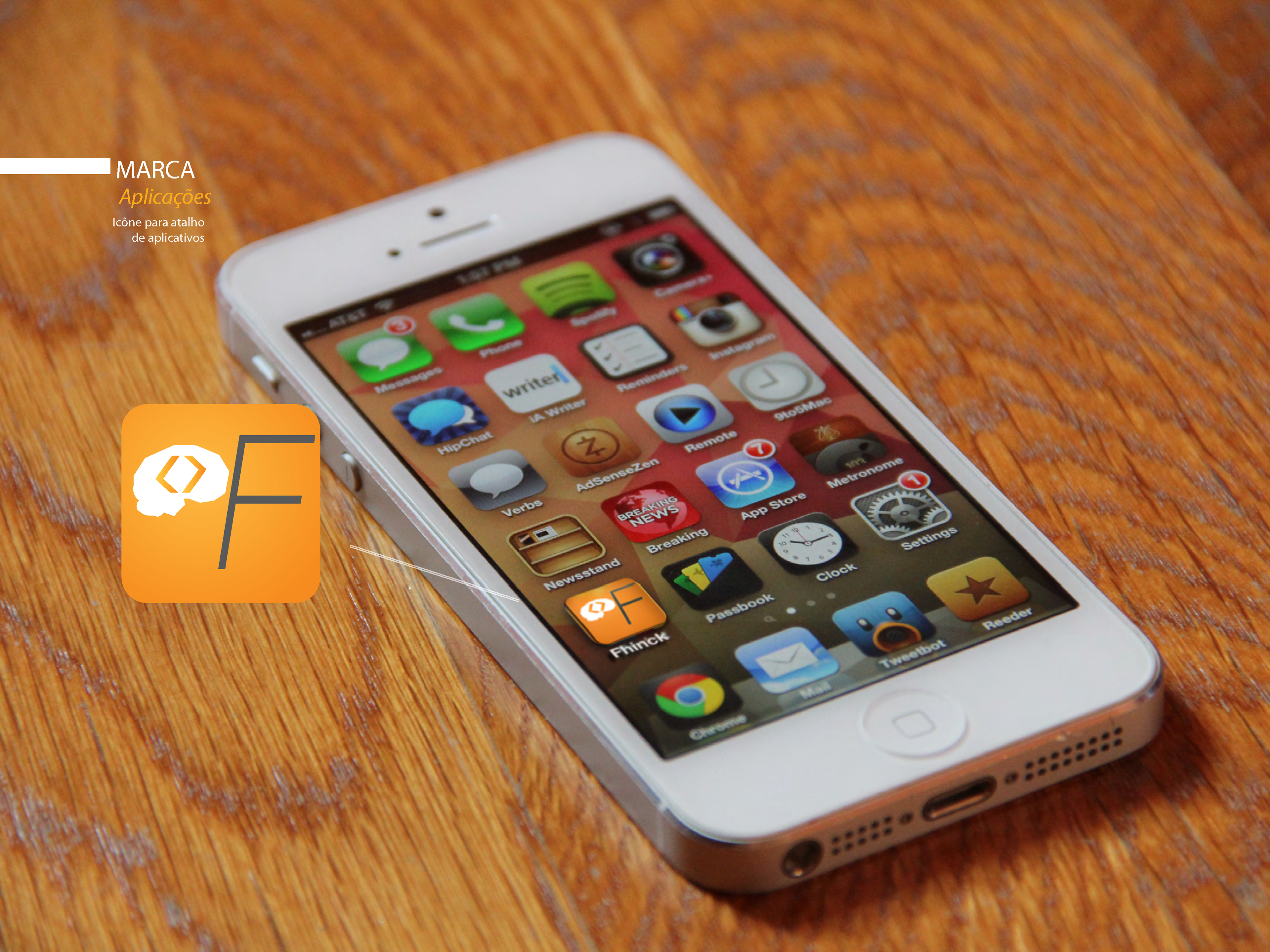
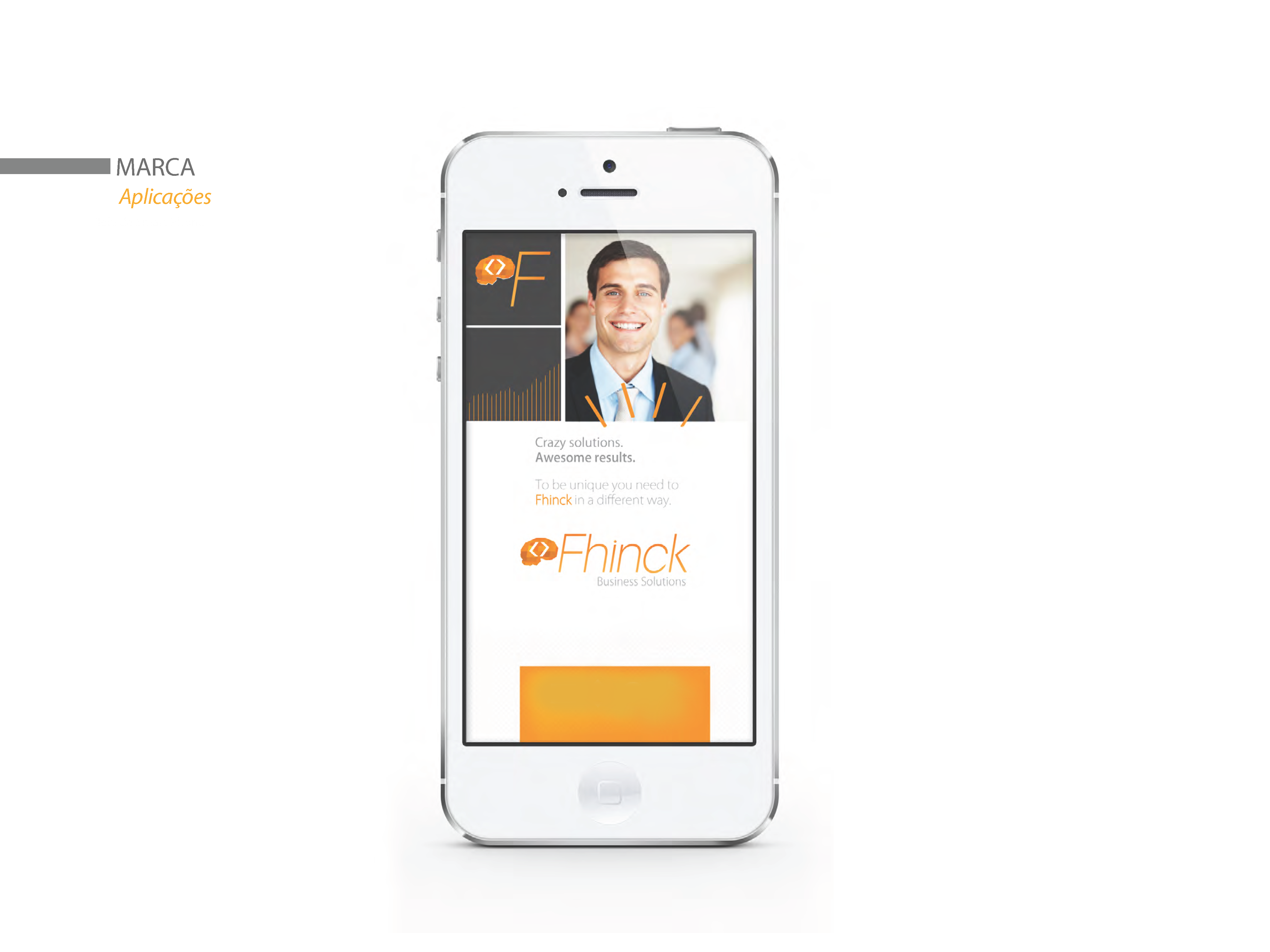
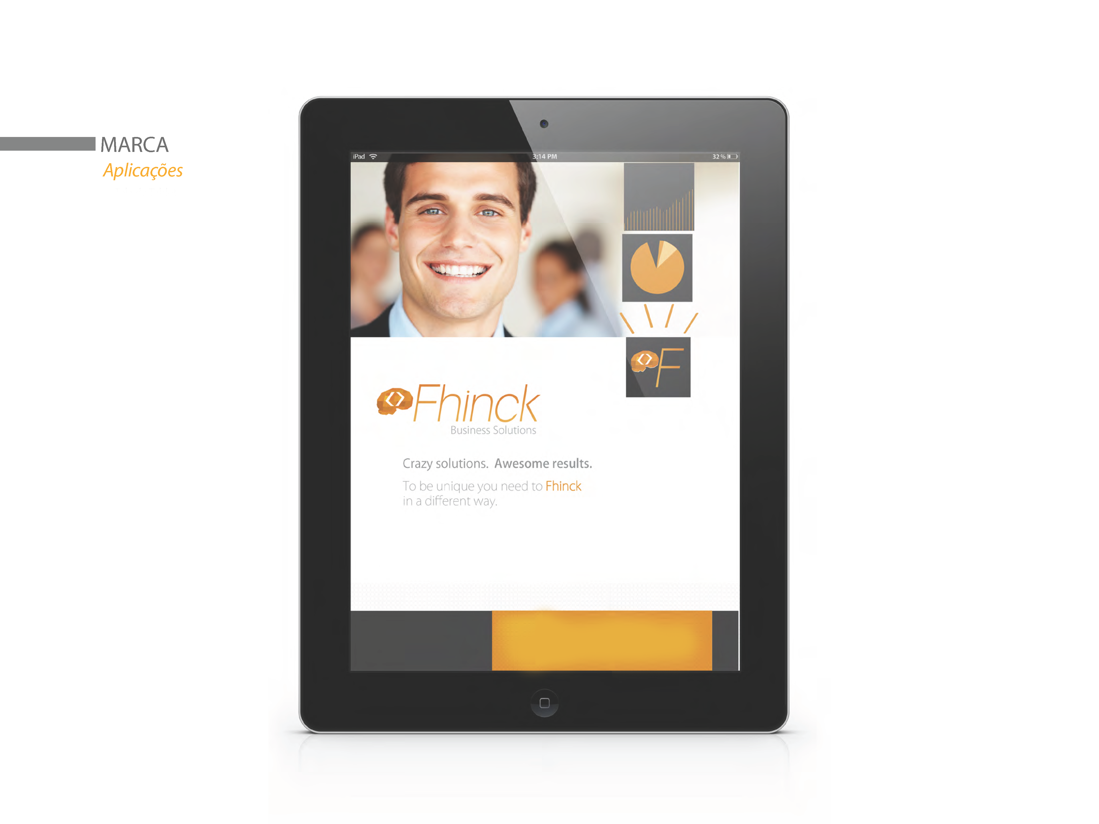
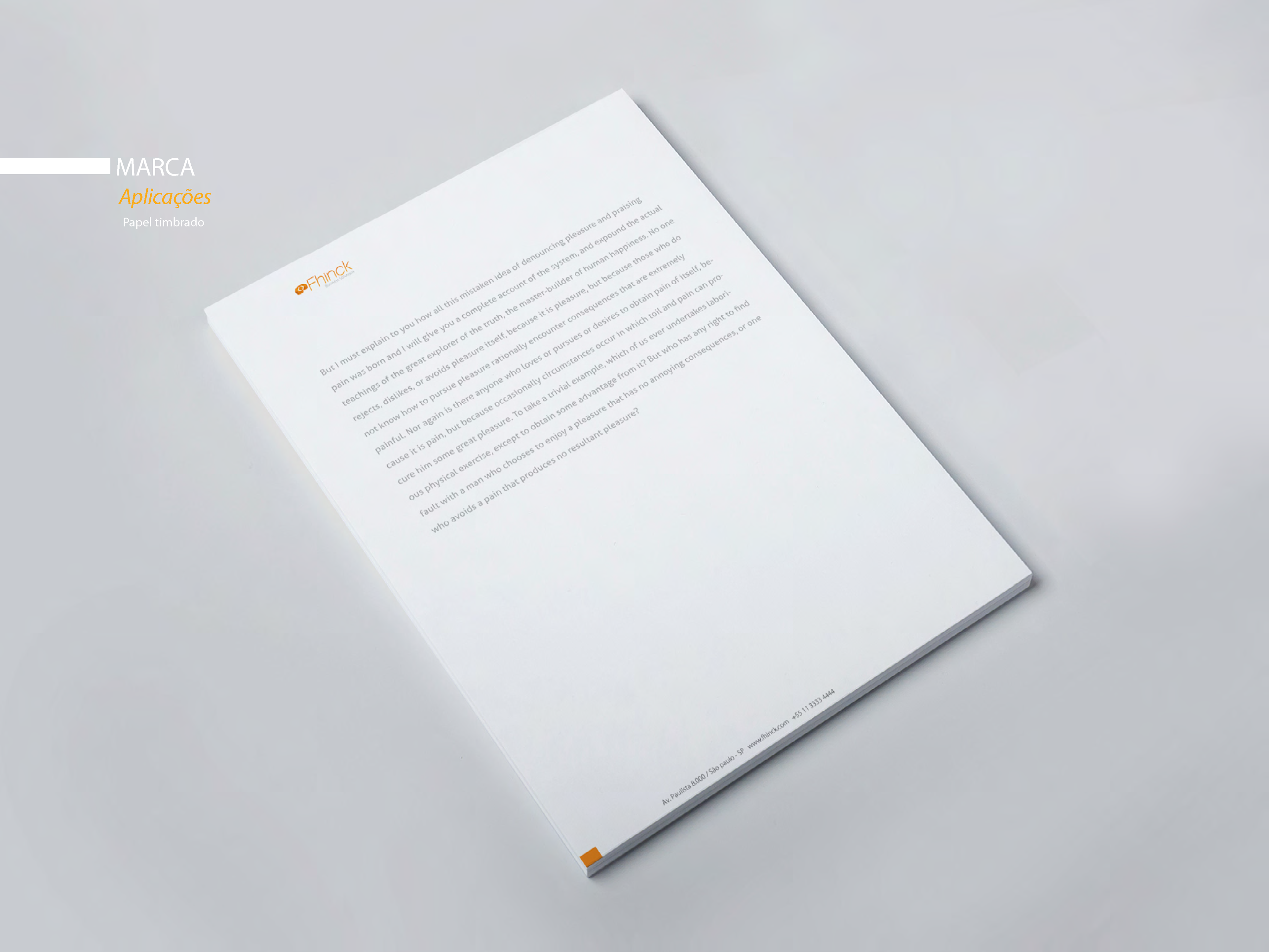
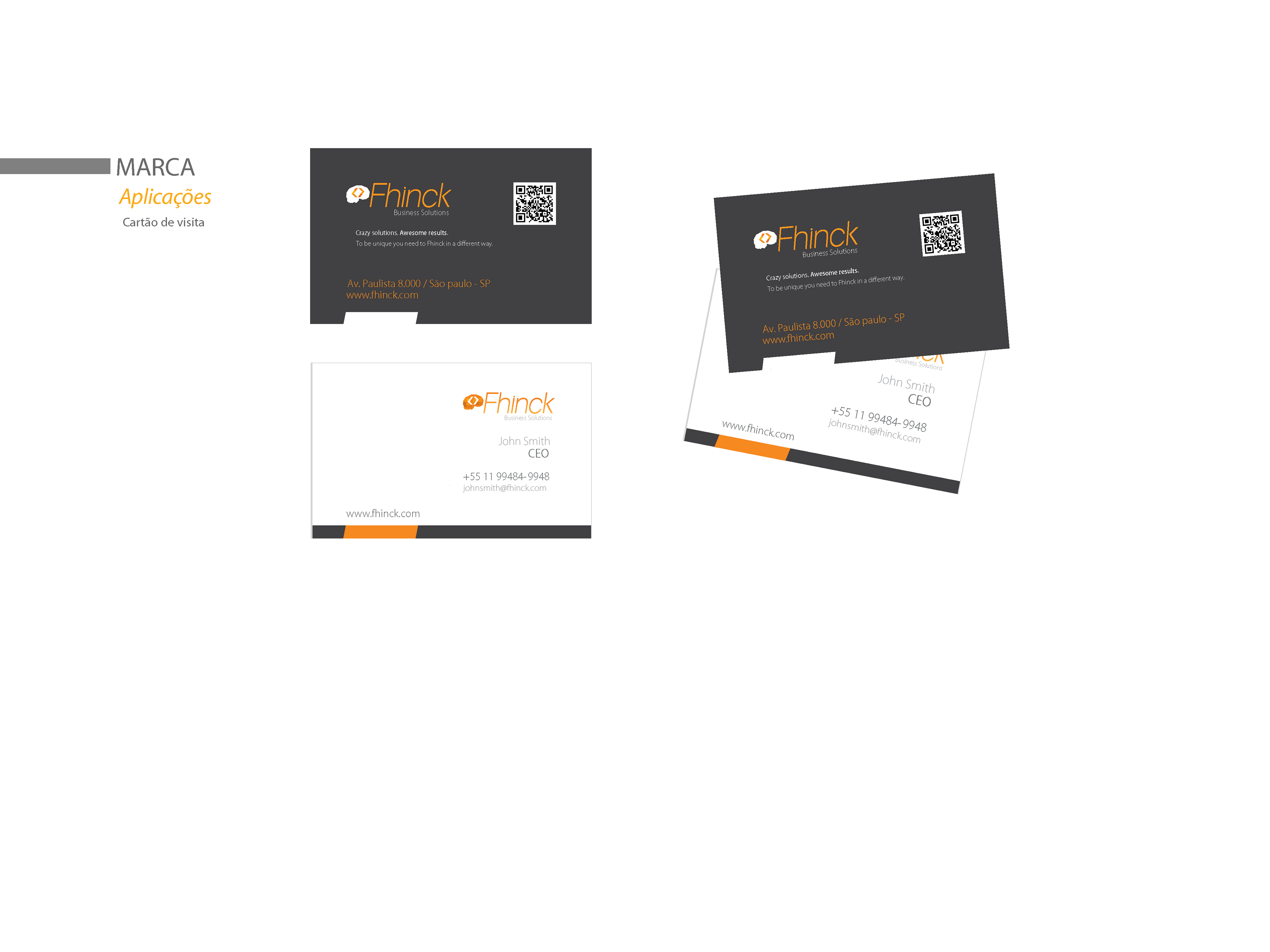
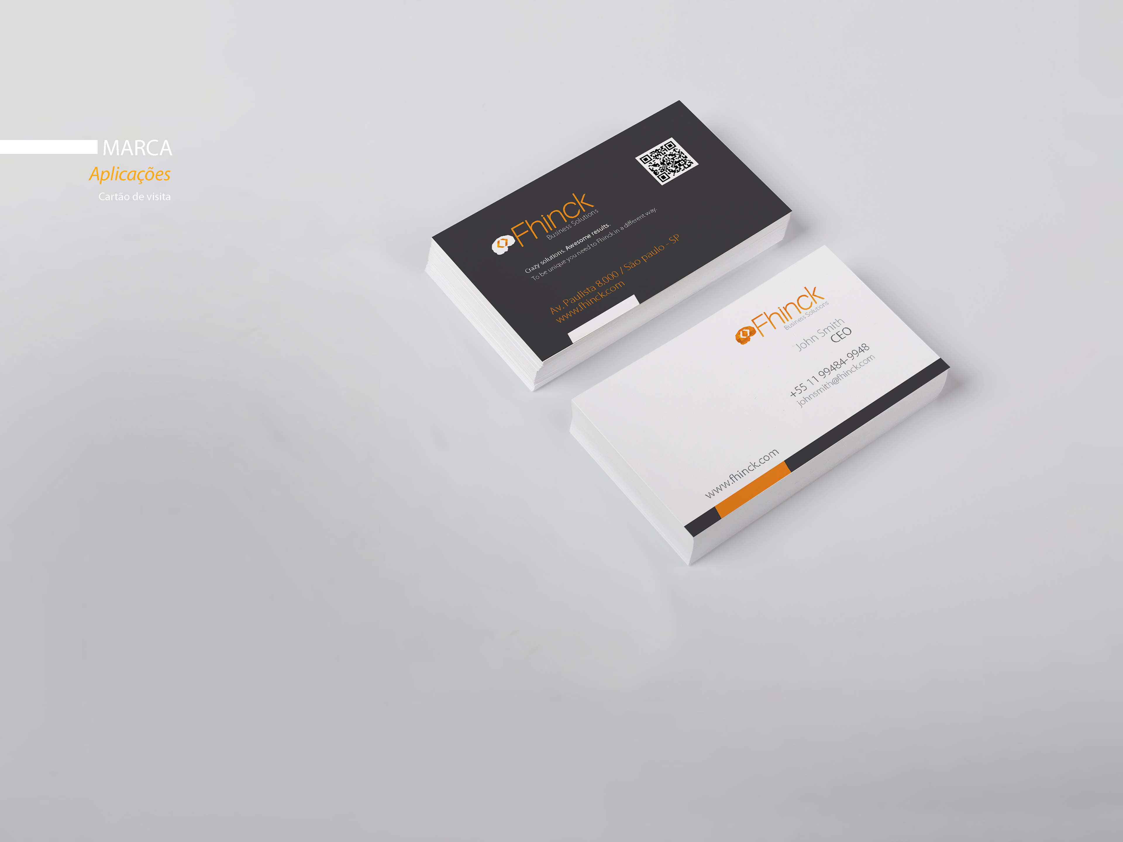
DISCOVER BELOW SOME APPLICATIONS AND VARIATIONS FOR THE BRAND